Hello everyone! We have some exciting news to share with you all. After months of hard work and dedication, we are thrilled to unveil our refreshed brand!
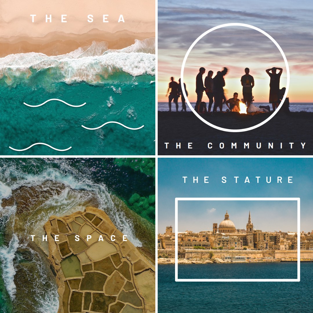
As you can see, our brand has a new look that better reflects who we are as a company. Our new logo is built on four essential elements: the sea, the community, the space, and the stature. These elements symbolize our commitment to our customers, our values, and our mission.
The sea represents our connection to nature and the environment. It is a reminder of our responsibility to protect the planet and its resources.
The community represents our dedication to building strong relationships with our customers, partners, and stakeholders. It reflects our belief that collaboration and cooperation are essential to success.
The space represents our commitment to innovation and exploration. It symbolizes our willingness to take risks, try new things, and push the boundaries of what’s possible.
Finally, the stature represents our vision for the future. It is a reminder of our ambition, our confidence, and our commitment to excellence.
Our rebranding goes beyond just a new logo. We have also revamped our website and social media channels to offer a more seamless and enjoyable user experience. You’ll notice changes to our color scheme, typography, and overall visual aesthetic.
We believe that our refreshed brand better represents who we are as a company and what we stand for. Our mission has always been to deliver exceptional products and services that exceed our customers’ expectations. We believe that our new brand identity will help us achieve this goal even more effectively.
We hope you love our new look as much as we do, and we can’t wait to continue sharing our journey with you. We welcome any feedback you may have, and we look forward to hearing from you soon.
Thank you for your continued support!
Best regards,
20Twenty Team
